


Problem Brief
Over the past decade, the smartphone has contributed a substantial amount of the tech industries soaring profits while enriching companies in multiple areas ranging from communication to entertainment to commerce. However, over the past couple of years, people including prominent industries figures have begun to voice their concerns about the amazing technology that has transformed society unlike any previous device. These concerns include how smartphones monopolize attention and consume users’ time much more than they would like. According to the research firm eMarketer, the smartphones ability to substitute for the radio, television and video game console has made it so influential that U.S. consumers now spend more than three hours a day on average using their smartphones, over an hour increase from 2013’s average. Further highlighting these concerns, earlier this year, a letter was sent to Apple from prominent shareholders insisting that they develop new software tools that would help limit phones use more easily and to study the impact of overuse on mental health.

Solution
Aiming to design a solution, we adopted a Value-Sensitive Design approach that focused on looking beyond just problems, tasks and activities by exploring values that the stakeholders try to express in their lives. This approach resulted in Mindful. Mindful is an extension of Apple’s iOS11 that adds OS Level features that help you control and stay aware of usage without compromising functionality. This is accomplished by reflecting these values heavily at a system level through five main features: Usage Indicator, Batched Notifications, Quick Launcher, Workhorse Mode, and Catch-Up. Mindful aims to provide rich lock screen functionality to iOS11 in order to assist it in becoming an OS that better respects your attention.

User Research
My partner on this project and I began this research with the assumption that the targeted user base will be a wide range of people including teenagers, college students, working professionals, and parents. We assumed that the user base relies on their smartphones for many everyday activities and was busy with some type of work whether it be their education or career. After developing the interview questions and overall research plan, I sought out people around The University of Washington to interview.
Research Goals
Crafting Interview Questions
We decided to conduct semi-structured interviews with smartphone users hoping to narrow down specific problems embedded in our broad research problem. Additionally, we wanted to develop a better insight into who the average smartphone user was and what their values were. Prior to conducting the interviews, we listed potential questions that may be asked during the sessions. These questions were centered on three topics:

A few examples of each topic are listed below:
Themselves:
· Questions about themselves (Age, Relationship, Occupation, What they are studying).
Their productivity:
· What does a day of work look like for you?
· What methods do you use to assist you in being productive?
· What factors cause you to be unproductive when you are trying to focus?
· How often do you feel like you had a good day of work when your work session is over?
Their Average daily smartphone use:
· What benefits does your smartphone bring into your life?
· What negatives impacts does your smartphone have on your life?
· Does utilizing your smartphone always give you fulfillment?
· How much fulfillment does utilizing your smartphone bring to your life
Followup: In what scenarios is it unfulfilling?· Can you imagine life without your smartphone? Why or why not?
· Are there times you use your smartphone when you don’t want to?
Followup: What makes you use your smartphone when you don’t want to?· What is your opinion on smartphone culture?
· What are your favorite smartphone activities and applications?
Lastly, we used this opportunity to ask the iPhone users I interviewed if they would use the Grayscale setting for a few days to see if it made them feel like it impacted their overall usage. Grayscale is a feature on iPhone that takes the color out of the entire OS as seen in these pictures below:
Interview Summary
After interviewing six people within the target audience, we were able to root out many features that take advantage of peoples’ attention as well as locate smartphone habits shared by many of them. Below I made a main takeaway and rainbow diagram to visuals the results of the interview:
For the past decade, the industry has been giving people reasons why they should have a smartphone and why they should get one. They are engineered to make us addicted and use them. Based on my research analysis, we have jumped to the conclusion that the industry no longer needs to convince people it is necessary to own a smartphone. Additionally, it is no longer necessary for them to use attention-grabbing tactics to take advantage of us and make us addicted. The industry knows how important our smartphones are to daily living, yet they continue to design products for overuse. The research findings support our conclusion that if products were designed for healthy use, consumers would still buy and use smartphones since its value has been proven as being an essential tool.
Direct & Indirect Stakeholder Analysis and Value Source Analysis
After analyzing our interviews, I listed who I believed was the direct stakeholders and the indirect stakeholders. Next, to distinguish between what values were held by the direct and indirect stakeholders, I conducted a Value Source Analysis. The process included identifying a few of each stakeholders’ values, and then italicizing the key values relating to the research problem and project.
Direct Stakeholders:
A. Smartphone users
· Fulfillment from their smartphone usage
· Knowledge
· Communication
· Time Management
· Self Control
· Security
· Productivity
· Immediate Gratification
· Functionality
· Deep Pool of Resources
· Freedom
· Organized
· Not Overwhelming
Indirect Stakeholders:
A. Mentors and Teachers
· Communication
· Attentiveness
· Respect
· Success of their Mentee/Student
· Time Well Spent
· Fairness
· Quality Work
· Time Management
B. Family
· Quality Interactions
· Communication
· Compassion
· Attentiveness
· Enjoyment with Each Other
· Appreciation
· Family Time
C. App Developers
· Quality App
· Current User Numbers
· Time Users Spend on Product
· Revenue
· User Enjoyment
· Problem Solving
· Total Downloads
D. Strangers
· Mutual Respect
· Attentiveness of Surroundings
· Solitude
E. Coworkers & Peers
· Quality Interactions
· Quality Work
· Punctual
· Attentiveness
· Respect
· Time Management
Competitive Analysis
In order to get a stronger grasp on the apparent issues, we analyzed competitors who have attempted to design for a similar research problem. With a small pool to select from, I chose to look at and learn from the Light Phone II which is an OS and new smartphone, and a productivity app called Forest.
CA


Personas
Through all our user research, we now understand what the average users affected by this problem look like. Based on my findings, we created three hypothetical user personas of people who are affected negatively by smartphones.


Defining the Key Pain Points
Based on our six interviews and my analyses, we identified that not only do users suffer from phone addiction, but users also are aware they have phone addiction and choose to do nothing about it. There are 5 core pain points that make up the central research problem which I have listed below:

Cluttered lock screen. After being away from their smartphone for a long time, such as when users sleep, have a productive session, or watch a movie, they return to a phone stacked with notifications. During this time, users are susceptible to spending too much time catching up on their notifications because there is more than likely a lot of content. The users might also feel like they have earned a long usage session after being away for some time.
Users feel the need to check notification right away & users receiving too many irrelevant notifications. With a variety of notifications coming in, users tend to check their smartphones every 15 minutes. Users struggle to be productive or to focus when their devices diverge their attention so often.
Going into smartphones to complete a quick task leads to users getting distracted. Whether it is to write down a reminder or tweet a quick thought, I believe that the once users unlock their phone they already lost the battle.
Users are not indicated of overuse. And why would they be? OS and app developers want them to use their software as often as possible, so why would they encourage users to take a step back? Through my research, I think this line of thinking could not be more wrong. Users do not need to be convinced to use their smartphones or their favorite applications anymore, most cannot go one day without them.
Smartphones make it harder for users to be productive. Plain and simple, they distract us when we want to be productive, and the only solution iOS11 has to this problem is the power button. Unfortunately, that is not an option for many users due to them needing to keep their smartphone powered on for emergency calls, or simpler reasons such as needing their notes to be open, or to have a playlist on while working.
Value Scenario & User Stories
After establishing the key pain points, we created three value scenarios and storyboards featuring user stories to illustrate how users experience these pain points daily. By depicting environments where these issues might arise, we could better focus on aspects of the research problem that I needed to solve in the final design.
Featured


Target Audience
Some attributes of the target audience are:
· Users who are conscious of their overuse and want less.
· Users who value time away from their phone without consequence
· Users who value productivity and focus
· Users who value getting their information efficiently
· Users who are overwhelmed by notifications
Design Principles
There are four primary design principles that we are requiring ourselves to follow for this design. They are:
1. Libertarian Paternalism Approach
Since the target audience is users who are aware of their addiction and want change, we do not want to take away functionality and we do not want to force them to stop using their phone unlike the Light Phone II or any other cold turkey approach. We just want to give users a small push in the right direction and let them do the rest themselves. No restrictions, just soft nudges.
2. Apple’s Human Interface Guidelines
Since Mindful is designed as an addition to Apple’s iOS11, we want to make sure that it feels like it could be on an iPhone and actually part of iOS11. Therefore, we are requiring ourselves to follows Apple’s style guide.
3. Value Sensitive Design Approach
We want to design for the values people try to express in their everyday lives. Due to this, as stated in the section above, we want to implant the values of time away from their phone, productivity, focus, and getting their personal information efficiently.
4. OS Level implementation
Everything will be implemented at the OS Level and we will avoid changing anything at the app level.
Goals:
Our primary goal is to return control of valuable attention back to users by designing for mindful usage without stripping away functionality. We want to utilize mindful design on iOS11 to provide users with an OS that does not monopolize attention. Mindful’s objectives are to:

Brainstorm
At the beginning of ideation, we aimed to come up with as many ideas as possible that could be addressed my main pain points. Here are pictures from our divergent thinking phase:


Solution
After coming up with as many solutions as possible, we used convergent thinking to narrow them down to five essential features that make iOS11 more mindful. Through lots of iteration and evolution, they are:
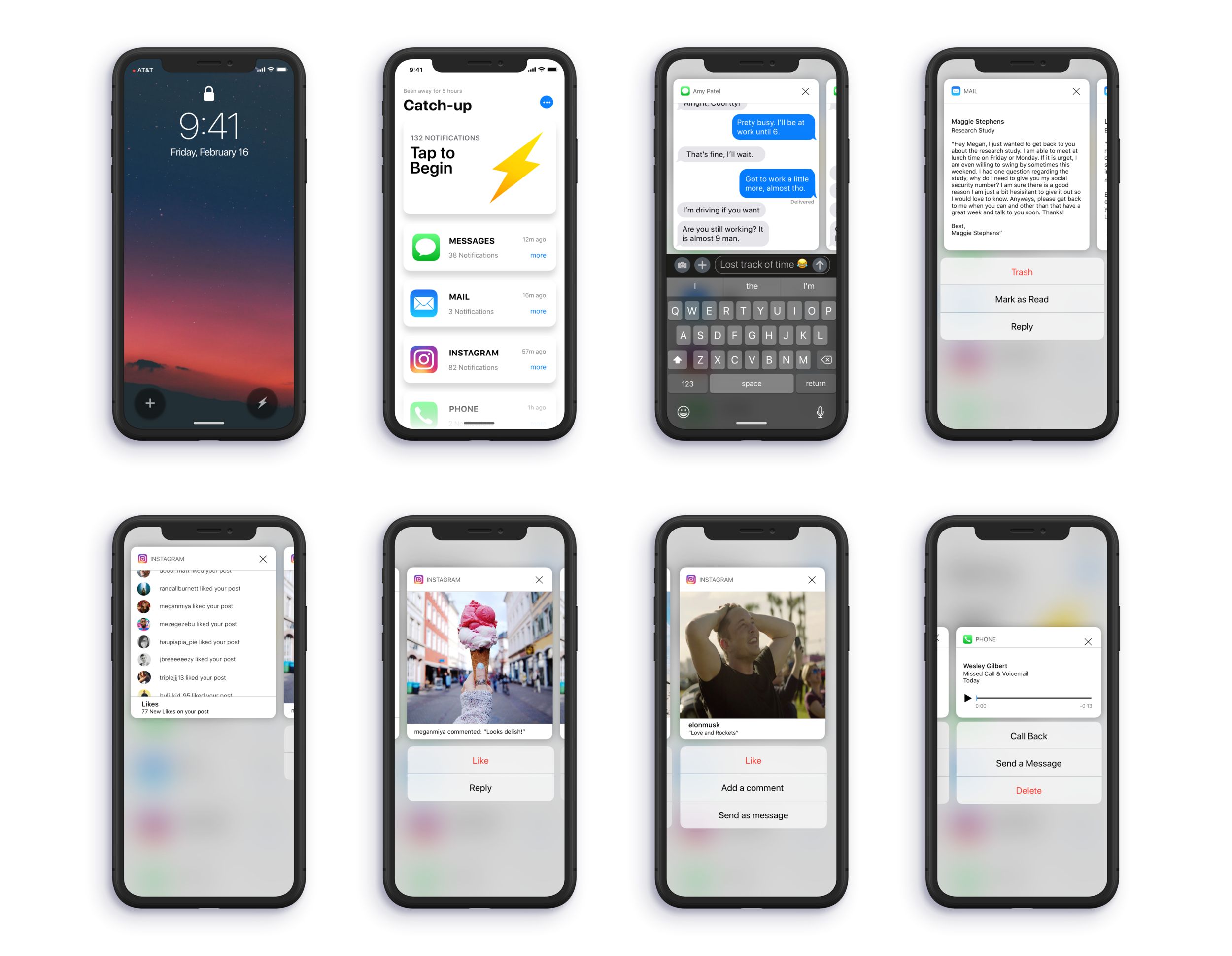
Usage Indicator
A small circle in the top left corner of the iOS11 lock screen that appears and changes color based on that day’s phone usage. This addresses our fourth pain point (Users are not indicated of overuse) while following Libertarian Paternalism principles and not taking away from iOS11’s beautiful lock screen.Batched Notifications
Batched Notifications aim to address our first (Cluttered lock screen) and second pain point (Users feel the need to check notification right away & users receiving too many irrelevant notifications) by grouping together notifications per application. An iOS11 Notification Center can get filled up fairly quickly with notifications resulting in over a hundred notifications from numerous apps. Worst of all, they lack proper order aside from time so iMessage group chats are intertwined with Messenger group chats intertwined with reminders, health updates, and all other types of notifications. It is a mess. By adding this feature, we can turn a Notification Center with 100 notifications to a small 10.Quick Launcher
This feature revolves around our third pain point (Going into the phone to complete a quick task leads to users getting distracted) and the idea that when users do not unlock their phone, it becomes much harder to get distracted. Quick Launcher adds app functionality to the lock screen to prevent users from entering the phone because my research makes me believe that this is where distraction and addiction starts. Applications are designed to grab and keep your attention, however, they cannot do that if you never open them.Workhorse Mode
Our solution to the fifth pain point (Smartphones make it harder for users to be productive) and most mentioned subproblem in my research: smartphones affecting productivity. Workhorse Mode strips the OS down to the most necessary functions and disables incoming notifications (aside from calls and text messages) for times when users want to engage in deep focus without giving up core functionality. The UI avoids detail, stylized animations, and color to refrain from pulling in the user.Catch-Up
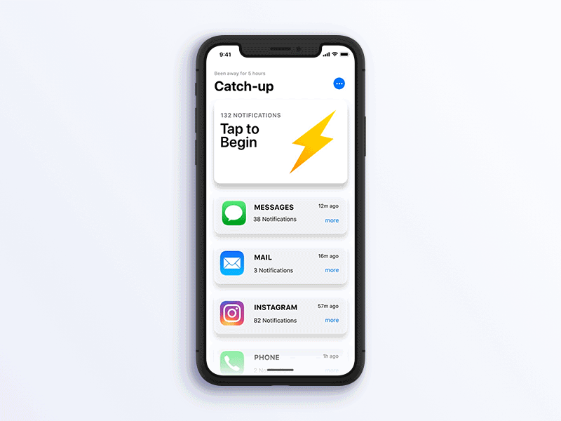
As elaborated on in pain point one (Cluttered lock screen), after spending many hours away from a phone, it’s common for users to want to catch up on notifications, social media, and other content they’ve missed. During this time, users are susceptible to spending too much time catching up because there might be a lot of content, and because the users’ might feel like they have earned a long usage session. It can take users over an hour to catch up on all their missed notifications and to navigate between every app. If users haven’t used their phones in for many hours, they experience a build-up of notifications, or if they exit Workhorse Mode, the Catch-Up bubble will appear in the bottom-right corner of the lock screen. Catch-Up takes users through a path of content showcasing representative highlights without launching any full apps. Catch-Up learns which content is important to the user over time.
Sketches
Having an understanding of the approach we wanted to take with Mindful, we began to sketch the potential layouts of the five features:
Sketches


Wireframes
After sketching our screens, we used Sketch to get a clearer visualization of the features and their contents. Additionally, we wanted to see if the features could properly “fit” in with the rest of iOS11:
Usage Indicator & Batched Notifications
Workhorse Mode
Quick Launcher
Catch-Up
Early Iterations
All of the five features went through a lot of evolution and iterations. Below are examples of the low-fidelity iterations each feature went through:
Early Iterations


Early Iterations 2


Final Product & Transitions
After a lot of careful consideration, the final iteration and its transitions are created:
Usage Indicator & Home Screen
Stay aware of your usage
The small circle in the top left corner appears and changes color based on that day’s phone usage to help users be more aware of their usage without taking away from iOS11’s elegant lock screen.

Batched Notifications
Clear up your cluttered lock screen
Mindful groups and properly orders users’ notifications resulting in a more clear and effective notification experience.
Quick Launcher
Accomplish tasks without getting distracted
By adding app functionality to the lock screen, Mindful takes away the users need to enter their phone to complete a simple task. This prevents users from getting distracted beyond their simple task and getting hooked onto application attention-grabbing tactics.
Workhorse Mode
Enter deep focus without losing essential functionality
Users have their OS stripped down to the most necessary functions and disables all incoming notifications (aside from calls and text messages for emergency purposes). With a phone that refrains from pulling them in, users can engage in productive work easily.
Catch-Up
Get through your notifications quickly and efficiently
Users are taken through a curated path of content that showcases highlights of notifications without launching any full apps. Users are able to respond to their notification build up swiftly and dynamically.
catchup


Next Step
I would love to take this project a step further in the future. The next step I envision would be designing an entire OS that integrates the principles of helping users control and stay aware of usage without compromising functionality. The proposed OS would accomplish this goal by reflecting those values heavily at a system level but subtly at an application level. While Mindful helps iOS11 become more mindful at a system level, I did not attempt to change the addictive factors layered in at the application level. There were a few ideas to make stock applications more mindful that came up during the brainstorming process but I was unable to capitalize on them. The entire OS would be a powerful, yet efficient, alternative to the toxic and addictive smartphone experiences of today for users who want a change. It would be neither addicting nor restrictive, it would be Mindful.
Reflection
While I consider this project a success, there were limitations that held it back. The first and largest limitation was the lack of resources I had for my research. If I had more time and money, I could have conducted more than just six semi-structured interviews. Ideally, I would have ran a longitudinal study involving GrayScale and the effects it had on users. Additionally, I would have liked to engage in productivity and smartphone-related research. Another issue was that the studied participants were all between the ages of 19 to 24 and attend The University of Washington which is an extremely undiverse pool of subjects. A third limitation was that I did not have my hands on the LightPhone 2 which made for a weaker competitive analysis of the product. Overall, I believe that some of my concepts lack adequate research and do need more iteration before it can properly solve the current problem. Furthermore, with better user data, experiments, and perhaps behavioral user research, the problem and proposed solution would be validated more accurately.
One specific issue that might relate to the final design concerns including Messages onto Workhorse Mode. Having access to Messages on Workhorse Mode seems counter-intuitive on paper, however my research proved otherwise. My research pointed to users using the stock Messaging app primarily with close friends and family members. On the contrary, they used alternate messaging platforms such as Slack, Messenger, WeChat, Email, etc. to communicate with other friends, peers, acquaintance, and coworkers. Since this is the case, including the Messaging app falls in line with the principles I aimed for Workhorse Mode to uphold (and the same reason I included the Phone app). I personally spend (waste) a lot of time on the Messaging app every day, and despite my gut opposing the research, I chose to include it in Workhorse mode. I am still unsure if I made the right decision, and ultimately it is the only issue I still have with the final design.
Regardless of my limitations, this research project has been a fantastic experience. I dove deeply into the user-centered design process and learned a lot. I became more proficient at the basic user research methodology leading me to give the problem everything I had idea-wise during the brainstorming phase. Additionally, throughout this process, I polished my equally important technical skills using Sketch and Principle to create my LoFi and HiFi screens. Overall, I am pleased with the end result and with how much I learned during this experience. I am proud of myself and feel the effort I put into this project was worthwhile.
Conclusion
Users do not need to be convinced to use their smartphones or their favorite applications anymore; most cannot go one day without them. It is time to start designing for healthy use, not maximum use. While I believe Mindful helps Apple iOS11 accomplish this task, there is still a lot more work to do. To end with the philosophy used by Nobel Prize winner Herbert A. Simon, “Information isn’t a scarce resource — attention is.”
Thank you for reading.
Additional Note!!
Since completing this project back in late April 2018, Apple has released iOS12 which includes many mindful features with some of them being very similar to ones I ideated in my research. As a developing UX Designer, I could not feel more proud that my own work, research, and ideation led to the same solutions for iOS as an Apple design team! I was so shocked and excited while watching Apple unveil these features live at WWDC this past June and had a huge smile on my face while using those features in mid-September when iOS12 was released. Most notably and accomplishing for me, iOS12’s Grouped Notifications solves the same problem my Batched Notifications does while functioning very similarly. Additionally, there were two features ideated in my brainstorm phase that I was unable to capitalize on in my final designs, but they did make it into Apple’s iOS12. These two ideas were:
A widget that tracked phone usage over the day, breaking up usage between applications. The center of this solution took inspiration from Apple WatchOS’s progress circles and replicated them onto the widget displaying application usage. This feature is similar to iOS12’s Screen Time.
A Sleep and Morning Mode that prevents users from getting swamped with notifications at night and eased users into them during the morning. Additionally, presents users with essential daily information such the weather and early calendar events. The idea stemmed from my research pointing to users looking at their smartphones within 20 minutes of waking up. This feature is similar to iOS12’s Bedtime Mode.
While I did not create screens for these two ideas, I am still proud to see top professionals at Apple reach the same solutions as I did. Overall, having my ideas displayed in iOS as soon as the next yearly iOS update (2018) is a big boost in my confidence as a growing UX Designer and made me even more excited to start my next project. All in all, it is simply neat to see my research findings validated by Apple professionals.