According to the research firm eMarketer, the smartphone’s ability to substitute for the radio, television and video game console has made it so influential that
U.S. consumers now spend more than three hours a day on average using their smartphones, over an hour increase from 2013’s average.
Further highlighting these concerns, earlier this year, a letter was sent to Apple from prominent shareholders insisting that they develop new software tools that would help limit phones use more easily and to study the impact of overuse on mental health.


This is accomplished by reflecting these values heavily at a system level through five main features:
Usage Indicator, Batched Notifications, Quick Launcher, Workhorse Mode, and Catch-Up.
Mindful aims to provide rich lock screen functionality to iOS11 in order to assist it in becoming an OS that better respects your attention. Below is a sneak peek of these five features respectively:
To skip over the detailed research, defining, and ideating parts of this case study and get straight to the overview of the final outcome, click on the button below.
USER RESEARCHBUILDING THE RESEARCH
I began this research with the assumption that the targeted user base will be a wide range of people including teenagers, college students, working professionals, and parents. I assumed that the user base rely on their smartphones for many everyday activities and was busy with some type of work whether it be their education or career. After developing the interview questions and overall research plan, I sought out people around The University of Washington to interview.
RESEARCH GOALS

INTERVIEWSCRAFTING THE
INTERVIEW QUESTIONS
I decided to conduct semi-structured interviews with smartphone users hoping to narrow down specific problems embedded in our broad research problem. Additionally, I wanted to develop a better insight into who the average smartphone user was and what their values were. Prior to conducting the interviews, I created a research plan and developed potential questions that may be asked during the sessions. The questions asked, the topics they centered around, and a rainbow diagram of the results are shown below:

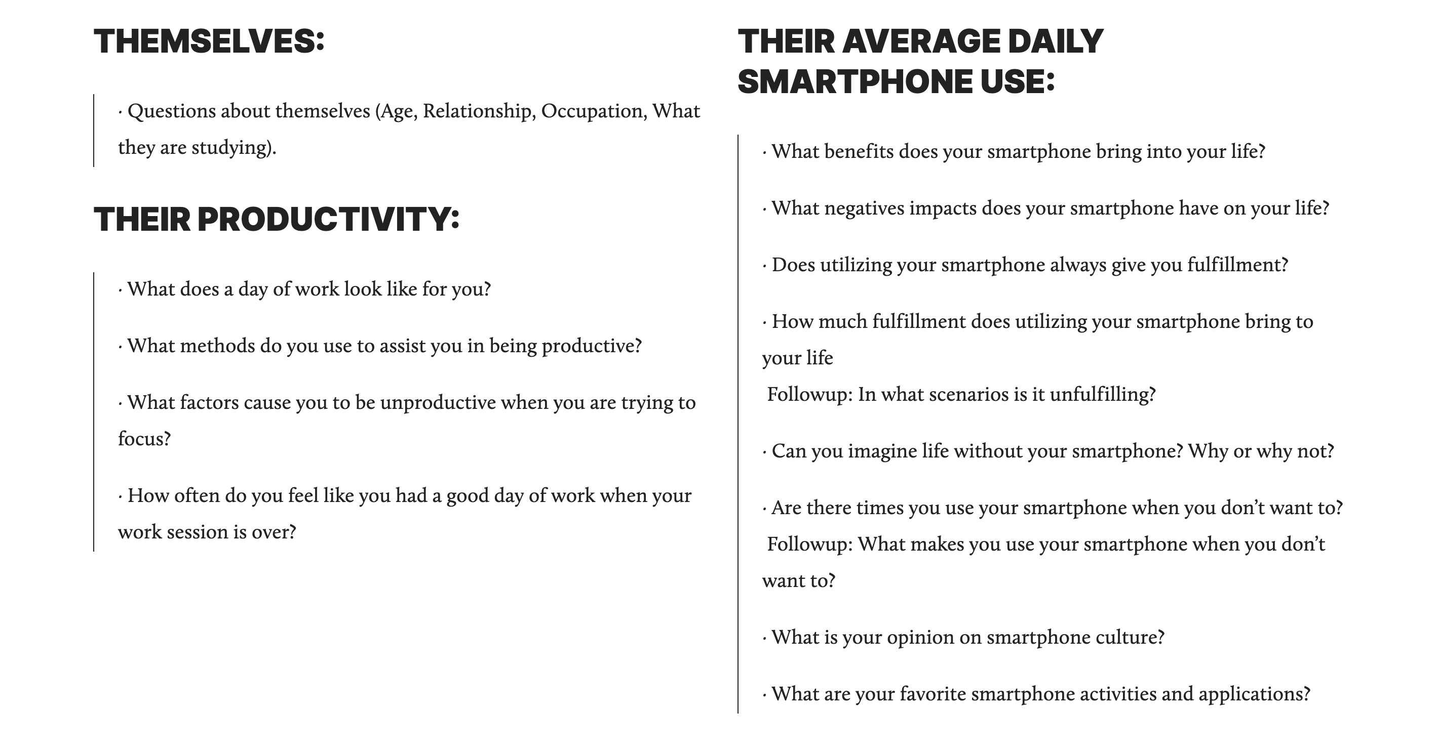 INTERVIEW QUESTIONS
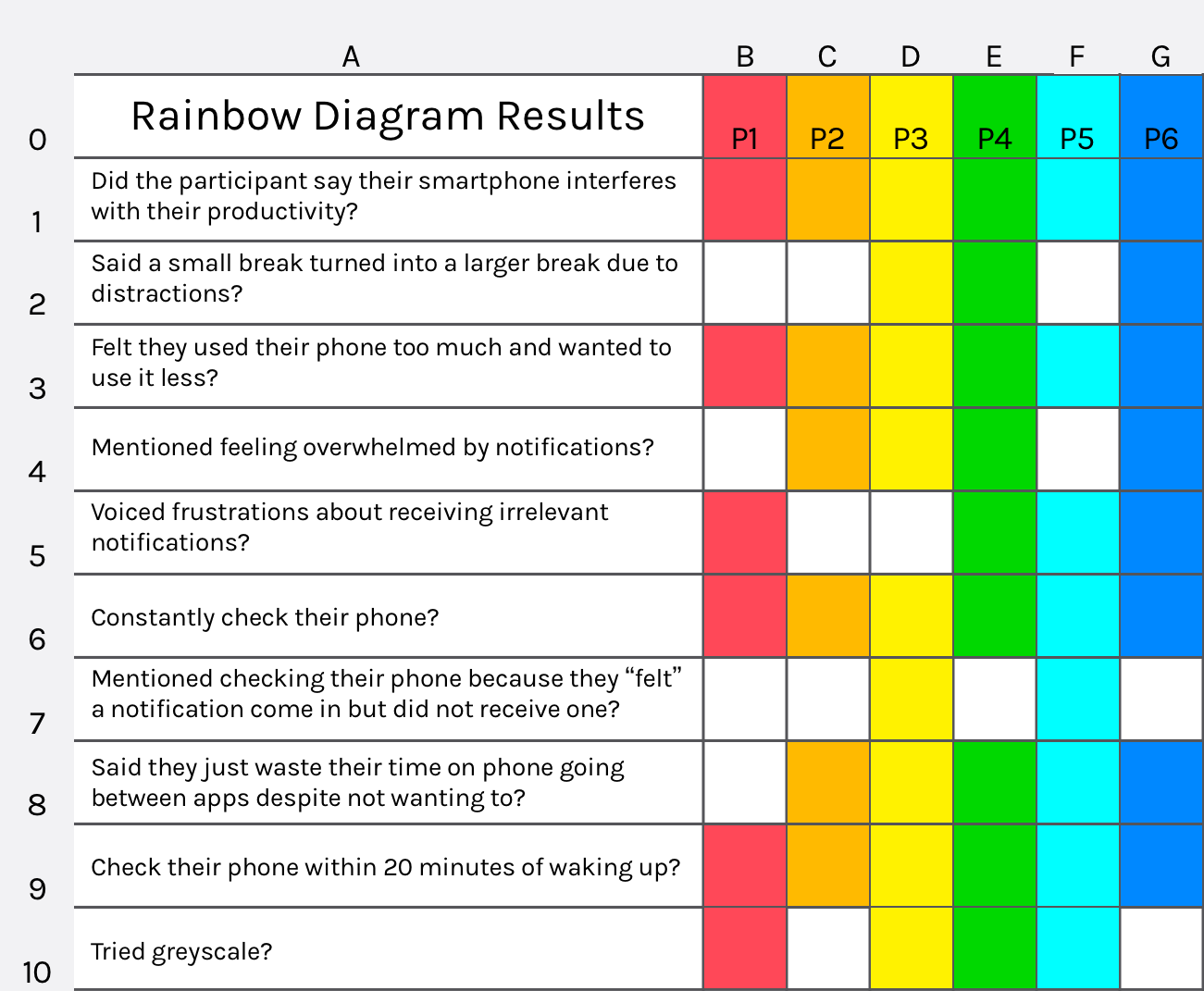 RAINBOW DIAGRAM RESULTS
EARLY RESEARCH CONCLUSIONS & INTERVIEW SUMMARYSmartphones are engineered to make us addicted and use them.
For the past decade, the industry has been giving people reasons why they should have a smartphone and why they should get one. They are engineered to make us addicted and use them. Based on my research analysis, I have jumped to the conclusion that the industry no longer needs to convince people it is necessary to own a smartphone.
It is no longer necessary for them to use attention-grabbing tactics to take advantage of us and make us addicted.
The industry knows how important our smartphones are to daily living, yet they continue to design products for overuse. The research findings support my conclusion that if products were designed for healthy use, consumers would still buy and use smartphones since its value has been proven as being an essential tool.

STAKEHOLDER ANALYSIS AND VALUE SOURCE ANALYSISIDENTIFYING THE USERS AND THEIR VALUES
After analyzing the interviews, I listed whom I believed was the direct stakeholders and the indirect stakeholders. Next, to distinguish between what values were held by the direct and indirect stakeholders, I conducted a Value Source Analysis. The process included identifying a few of each stakeholders’ values, and then bolding the key values relating to the research problem and project.

TARGET AUDIENCEHONING IN ON THE TARGET
Some attributes and characteristics of the target audience are:


PERSONAMEET THE USERS
Through my user research, I now understand what the average users affected by this problem look like. Based on my findings, I created three hypothetical user personas of people who are affected negatively by smartphones.


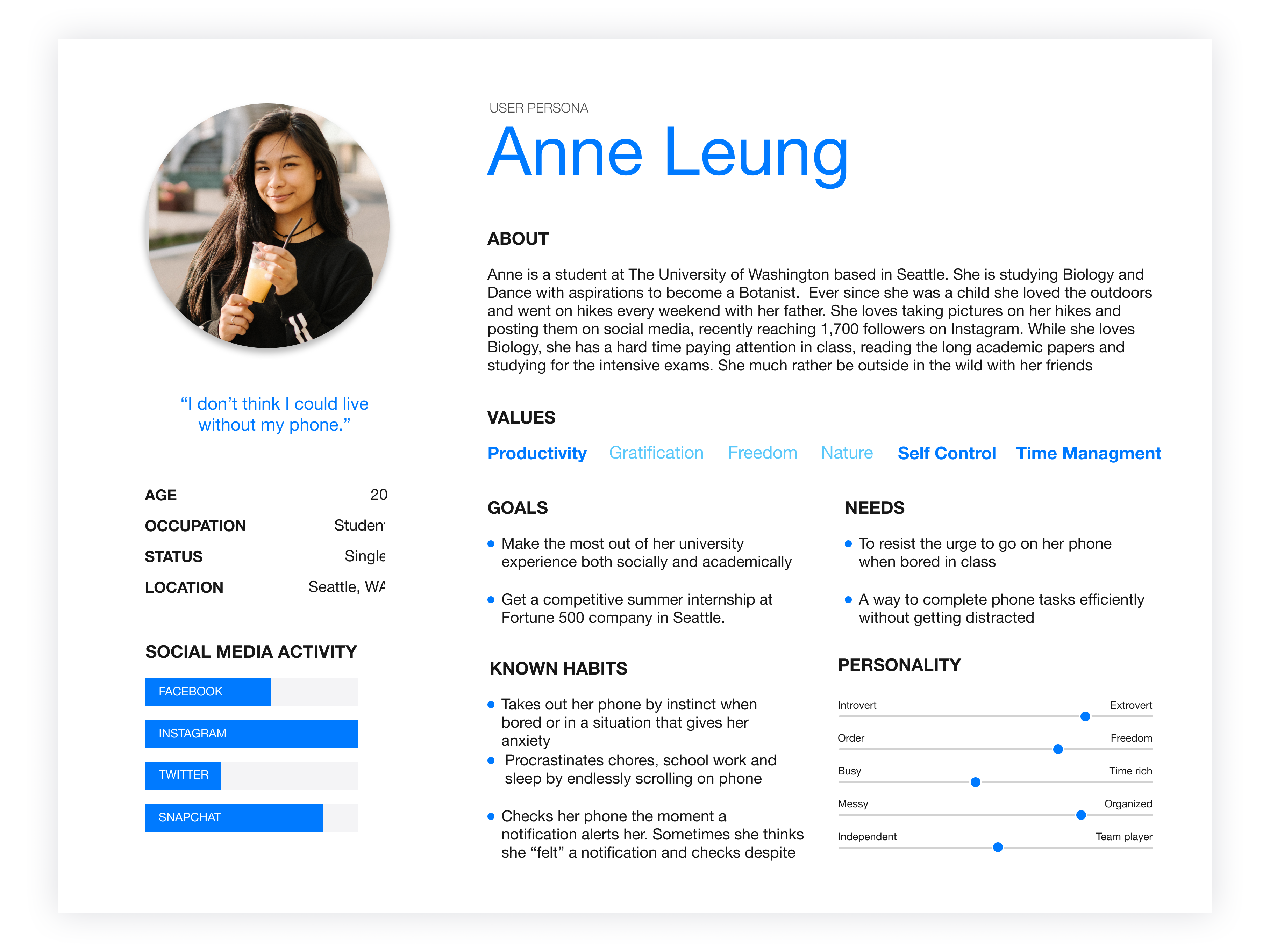 MEET ANNE
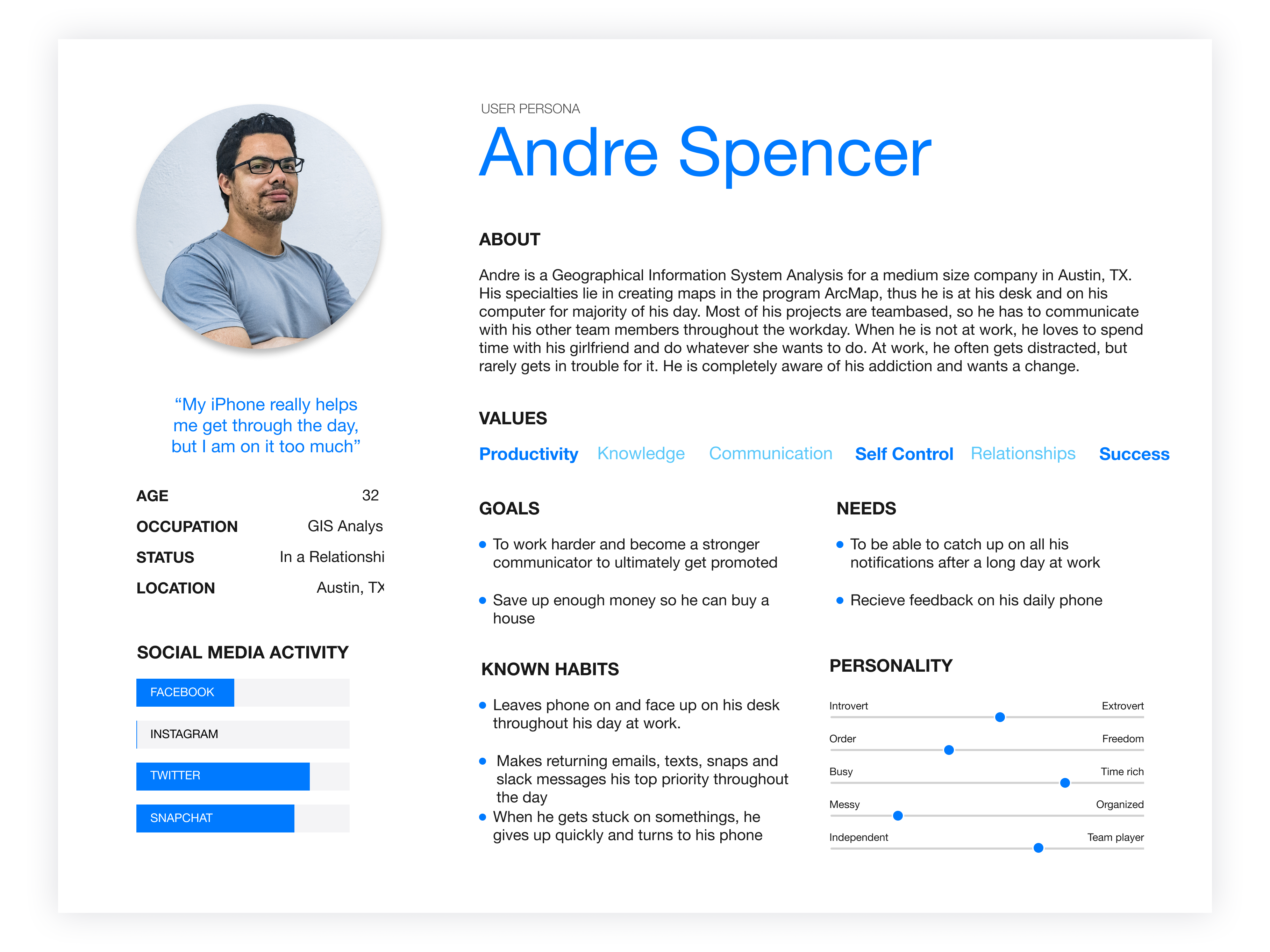 MEET ANDRE
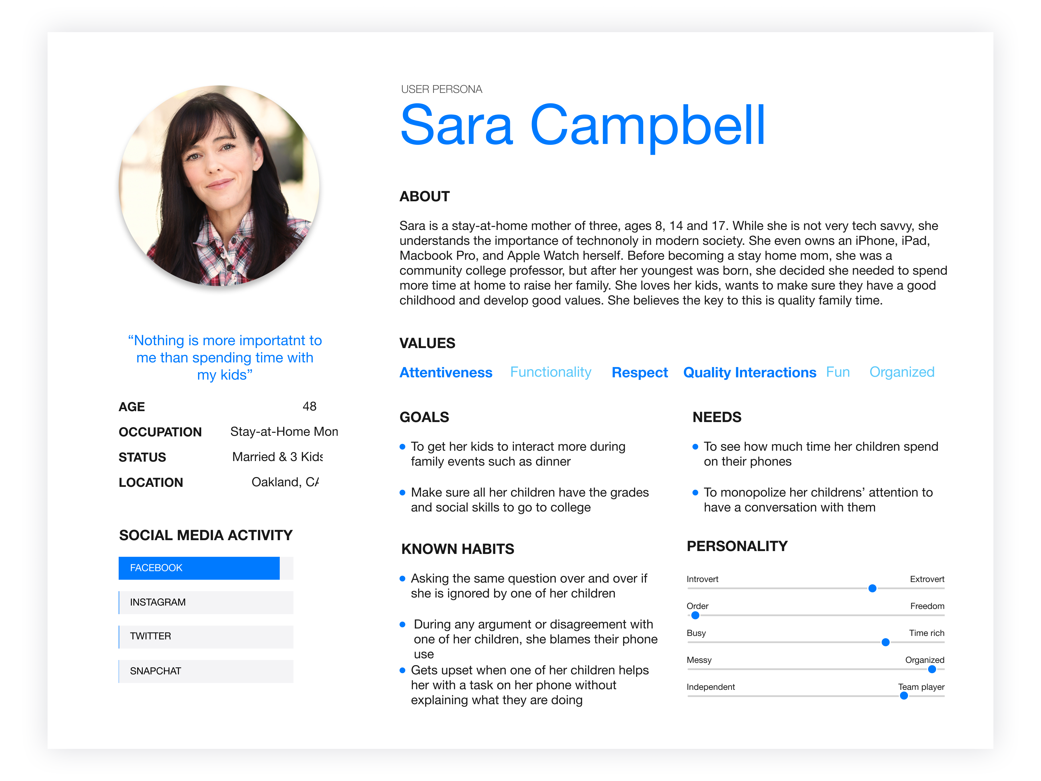 MEET SARA
COMPETITIVE ANALYSISANALYZING THE MARKET
To get a stronger grasp on the apparent issues, I analyzed competitors who have attempted to design for a similar research problem. With a small pool to select from, I chose to look at and learn from the Light Phone II which is an OS and new smartphone, and a productivity app called Forest.
Light Phone II — click for a closer look
The Light Phone II pushes users too hard. They take away the great applications of smartphones and chooses minimalism over functionality. Their approach is one way to design around the research problem, but before anything else, I think the smartphone is a fantastic tool, and while it has its apparent issues, I should not remove all of its benefits just to respond to the research problem. I do not want to force users to into fewer options; instead, I want to nudge them to choose healthier options at their own will.
Forest Competitive Analysis — click for a closer look
Forest is an amazing solution to one of the sub-problems of the broader smartphone issue — productivity. It is a fun efficient way to self-motivate users and to nudge them to be productive. Gamifying the experience provides incentives to be more productive and to leave their smartphones alone as they focus.
DEFINE
KEY PAIN POINTSDEFINING THE PAIN POINTS
Based on my six interviews and analyses, I identified that not only do users suffer from phone addiction, but users also are aware they have phone addiction and choose to do nothing about it. There are 5 core pain points that make up the central research problem which I have listed below:

Credit: DrawKit
1. CLUTTERED LOCK SCREEN
After being away from their smartphone for a long time, such as when users sleep, have a productive session, or watch a movie, they return to a phone stacked with notifications. During this time, users are susceptible to spending too much time catching up on their notifications because there is more than likely a lot of content. The users might also feel like they have earned a long usage session after being away for some time.

Credit: DrawKit
2. USERS FEEL THE NEED TO CHECK NOTIFICATIONS RIGHT AWAY & USERS RECEIVING TOO MANY IRRELEVANT NOTIFICATIONS
With a variety of notifications coming in, users tend to check their smartphones every 15 minutes. Users struggle to be productive or to focus when their devices diverge their attention so often.

Credit: DrawKit
3. GOING INTO SMARTPHONES TO COMPLETE A QUICK TASK LEADS TO USERS GETTING DISTRACTED
Whether it is to write down a reminder or tweet a quick thought, I believe that once users unlock their phone they already lost the battle.

Credit: DrawKit
4. USERS ARE NOT INDICATED OF OVERUSE
And why would they be? OS and app developers want them to use their software as often as possible, so why would they encourage users to take a step back? Through my research, I think this line of thinking could not be more wrong. Users do not need to be convinced to use their smartphones or their favorite applications anymore, most cannot go one day without them.

Credit: DrawKit
5. SMARTPHONES MAKE IT HARDER FOR USERS TO BE PRODUCTIVE
Plain and simple, they distract us when we want to be productive, and the only solution iOS11 has to this problem is the power button. Unfortunately, that is not an option for many users due to them needing to keep their smartphone powered on for emergency calls, or simpler reasons such as needing their notes to be open, or to have a playlist on while working.
USER STORIES & VALUE SCENARIOPAIN POINTS IN ACTION
After establishing the key pain points, I created three value scenarios and storyboards featuring user stories to illustrate how users experience these pain points daily. By depicting environments where these issues might arise, I could better focus on aspects of the research problem that I needed to solve in the final design.
CLICK TO VIEW FULL STORYBOARD


DESIGN REQUIREMENTSTHE FOUR REQUIREMENTS THE DESIGN SHOULD FOLLOW

APPLE’S HUMAN INTERFACE GUIDELINES
Since Mindful is designed as an addition to Apple’s iOS11, I want to make sure that it feels like it could be on an iPhone and actually part of iOS11. Therefore, I am requiring myself to follows Apple’s style guide.

OS LEVEL IMPLEMENTATION
Everything will be implemented at the OS Level and I will avoid changing anything at the app level.

LIBERTARIAN PATERNALISM APPROACH
Since the target audience is users who are aware of their addiction and want change, I do not want to take away functionality and I do not want to force them to stop using their phone unlike the Light Phone II or any other cold turkey approach. I just want to give users a small push in the right direction and let them do the rest themselves. No restrictions, just soft nudges.

VALUE SENSITIVE DESIGN APPROACH
I want to design for the values people try to express in their everyday lives. Due to this, as stated in the section above, I want to implant the values of time away from their phone, productivity, focus, and getting their personal information efficiently.
DESIGN GOALSHOW TO KEEP THE POWER WITH THE USER
The primary goal is to return the control of valuable attention back to users by designing for mindful usage without stripping away functionality. I want to utilize mindful design on iOS11 to provide users with an OS that does not monopolize attention.

IDEATE
INITIAL BRAINSTORMTHINKING ABOUT WHAT MINDFUL COULD BE
At the beginning of ideation, I aimed to come up with as many ideas as possible that could be addressed my main pain points. Here are pictures from my divergent thinking phase that show early versions of the five final concepts:


SOLUTION, SKETCHES, WIREFRAMES, & ITERATIONSKEEPING THE CONTROL IN THE USERS’ HAND
After coming up with as many solutions as possible, I used convergent thinking to narrow them down to five essential features that make iOS11 more mindful. Through lots of iteration and evolution, they are:
1. USAGE INDICATOR
A small circle in the top left corner of the iOS11 lock screen that appears and changes color based on that day’s phone usage. This addresses the fourth pain point (Users are not indicated of overuse) while following Libertarian Paternalism principles and not taking away from iOS11’s beautiful lock screen.
 VIEW SKETCHES
 VIEW WIREFRAMES

One early concept for the usage indicator was a color shadow that appeared under the notch. I decided it was too noticeable so I made an adjustment that eventually landed it on the small circle in the top left corner of the screen.
2. BATCHED NOTIFICATIONS
Batched Notifications aim to address our first (Cluttered lock screen) and second pain point (Users feel the need to check notification right away & users receiving too many irrelevant notifications) by grouping together notifications per application. An iOS11 Notification Center can get filled up fairly quickly with notifications resulting in over a hundred notifications from numerous apps. Worst of all, they lack proper order aside from time so iMessage group chats are intertwined with Messenger group chats intertwined with reminders, health updates, and all other types of notifications. It is a mess. By adding this feature, we can turn a Notification Center with 100 notifications to a small 10.

I did not iterate that much on batch notifications throughout the process and the core of the concept stayed the same from start to finish.
3. QUICK LAUNCHER
This feature revolves around our third pain point (Going into the phone to complete a quick task leads to users getting distracted) and the idea that when users do not unlock their phone, it becomes much harder to get distracted. Quick Launcher adds app functionality to the lock screen to prevent users from entering the phone because my research makes me believe that this is where distraction and addiction starts. Applications are designed to grab and keep your attention, however, they cannot do that if you never open them.
 VIEW SKETCHES
 VIEW WIREFRAMES

I experimented a lot with many different ways to implant this feature. The design I landed on was one that fit into Apple’s Human Interface Guidelines and felt like it could exist in iOS11.
4. WORKHORSE MODE
My solution to the fifth pain point (Smartphones make it harder for users to be productive) and the most mentioned subproblem in my research: smartphones affecting productivity. Workhorse Mode strips the OS down to the most necessary functions and disables incoming notifications (aside from calls and text messages) for times when users want to engage in deep focus without giving up core functionality. The UI avoids detail, stylized animations, and color to refrain from pulling in the user.
 VIEW SKETCHES
 VIEW WIREFRAMES

While the concept of Workhorse Mode stayed the same through each iteration, the design evolved quite a bit.
5. CATCH-UP
As elaborated on in pain point one (Cluttered lock screen), after spending many hours away from a phone, it’s common for users to want to catch up on notifications, social media, and other content they’ve missed. During this time, users are susceptible to spending too much time catching up because there might be a lot of content, and because the users’ might feel like they have earned a long usage session. It can take users over an hour to catch up on all their missed notifications and to navigate between every app. If users haven’t used their phones in for many hours, they experience a build-up of notifications, or if they exit Workhorse Mode, the Catch-Up bubble will appear in the bottom-right corner of the lock screen. Catch-Up takes users through a path of content showcasing representative highlights without launching any full apps. Catch-Up learns which content is important to the user over time.
 VIEW SKETCHES
 VIEW WIREFRAMES

Catch-Up was tricky to design properly and early iterations of it took inspiration from Twitter Moments.

FINAL PRODUCT & TRANSITIONS
After a lot of careful consideration, the final iteration and its transitions are created:
USAGE INDICATOR & HOME SCREEN
Stay aware of your usage
The small circle in the top left corner appears and changes color based on that day’s phone usage to help users be more aware of their usage without taking away from iOS11’s elegant lock screen.
Note the small circle in the top left corner.
×
![]()
BATCHED NOTIFICATIONS
Clear up your cluttered lock screen
Mindful groups and properly orders users’ notifications resulting in a more clear and effective notification experience.

×
![]()
QUICK LAUNCHER
Accomplish tasks without getting distracted
By adding app functionality to the lock screen, Mindful takes away the users need to enter their phone to complete a simple task. This prevents users from getting distracted beyond their simple task and getting hooked onto application attention-grabbing tactics.

×
![]()
WORKHORSE MODE
Enter deep focus without losing essential functionality
Users have their OS stripped down to the most necessary functions and disables all incoming notifications (aside from calls and text messages for emergency purposes). With a phone that refrains from pulling them in, users can engage in productive work easily.
×
![]()
CATCH-UP
Get through your notifications quickly and efficiently
Users are taken through a curated path of content that showcases highlights of notifications without launching any full apps. Users are able to respond to their notification build up swiftly and dynamically.

×
![]()
NEXT STEPSRUNNING FORWARD
I believe there is a lot of potential for future iterations of Mindful. Some next steps are:
Providing Usage Indicator with a proper icon. The lack of an icon in Usage Indicator is confusing to users on what the bubble actually means. Is it for overuse? Is it for network connectivity? Or is it for something else?
Subtle application level integration. While Mindful helps iOS11 become more mindful at a system level, I did not attempt to change the addictive factors layered in at the application level. There is a lot of potential in making Apple stock applications more mindful.
Testing for the specifics measurements. Some of these features need more testing to be considered fully functional. There are some questions I do not know the answer to such as "After how many hours of smartphone usage does Usage Indicator appear?" or "How much notification build-up is necessary for a full Catch-Up walkthrough?" I can only find the appropriate answer to questions like these by testing further and figuring out what amount of daily smartphone usage is healthiest.
Usability. My target audience is ambitiously every person with a smartphone that values time away from it. Targeting this vast group of people means considering how to make Mindful usable for even those with disabilities such as color blindness, mobility impairments, and weak vision. Addressing these common disabilities among others would be an important next step for Mindful.
The overarching next step a goal is to make an entire OS that integrates Mindful's principles of helping users control and stay aware of usage without compromising functionality. The entire OS would be a powerful, yet efficient, alternative to the toxic and addictive smartphone experiences of today for users who want a change.

REFLECTION & WHAT I LEARNEDLOOKING BACK
Mindful is an independent project that addressed an issue in technology that I am personally very passionate about. Through the process, I grew professionally and personally. Reflecting on the process, here are some of the things I have learned:
Too much research. With Mindful being one of my first times individually going through the entire design process, I wanted to be thorough and do/practice as many research methods as possible. I now understand that research and ideation methods are a lot like keys on a piano. While there are 88 keys, you only need a handful of them to play an excellent song. In design, you only need a carefully selected few research methods to reach proper understanding and comfortability in a design space if you set out realistic goals and search for actionable outcomes. I now realize that doing research methods for the sake of doing them is more often than a waste of time. One example of this reflection point is my pain points in action storyboards.
Undiverse interview recruitment results in weaker insights. The main issue is that the studied participants were all between the ages of 19 to 24 and attend The University of Washington which is an extremely undiverse pool of subjects. Additionally, I ideally should have conducted twelve semi-structured interviews instead of just six. I would have also liked to conduct a more long-term productivity and smartphone-related research.
Follow my research instead of my bias. An example of this having access to Messages on Workhorse Mode as it seems counter-intuitive on paper. However, my research pointed to users using the stock Messaging app primarily with close friends and family members. On the contrary, they used alternate messaging platforms such as Slack, Messenger, WeChat, Email, etc. to communicate with other friends, peers, acquaintances, and coworkers. Since this is the case, including the Messaging app falls in line with the principles I aimed for Workhorse Mode to uphold (and the same reason I included the Phone app). I personally spend (waste) a lot of time on the Messaging app every day, and despite my gut opposing the research, I chose to include it in Workhorse mode.
CONCLUSIONWRAPPING IT ALL UP
Users do not need to be convinced to use their smartphones or their favorite applications anymore; most cannot go one day without them. It is time to start designing for healthy use, not maximum use. While I believe Mindful helps Apple iOS11 accomplish this task, there is still a lot more work to do. To end with the philosophy used by Nobel Prize winner Herbert A. Simon:

ADDITIONAL NOTE
Since completing this project back in late April 2018, Apple has released iOS12 which includes many mindful features with some of them being very similar to ones I ideated in my research. As a developing UX Designer, it is rewarding to see my research and ideation lead to similar solutions for iOS as an Apple design team. I was excited while watching Apple unveil these features live at WWDC this past June (2018). Most notably and accomplishing for me, iOS12’s Grouped Notifications solves the same problem my Batched Notifications does while functioning very similarly. Overall, having my ideas displayed in iOS as soon as the next yearly iOS update (2018) is a big boost in my confidence as a growing UX Designer. All in all, it is simply neat to see my research findings validated by seasoned Apple professionals and to see the industry move in a more mindful direction.
EXPLORE OTHER WORK